Phlur

Fragrance inspired by memories, moments and shared experiences.
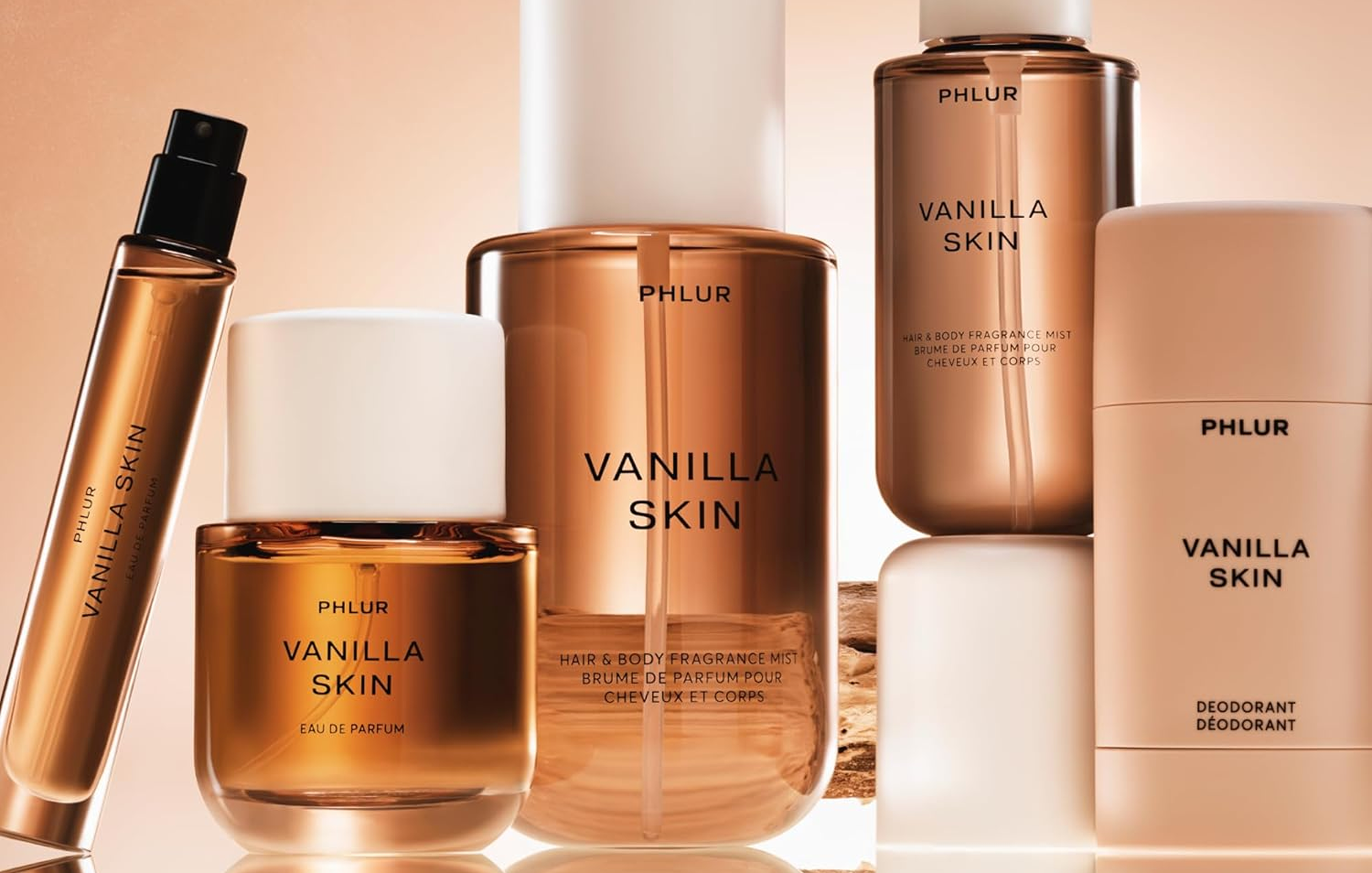
I designed to drive higher purchase conversion and loyalty program adoption across an eCommerce site with ~500k monthly visitors.

This summer, I joined Phlur as a freelance designer, working under the guidance of lead designer Chase Gray.

Together, we brainstormed, iterated, and shipped UI improvements across the entire site, focusing on product discovery, navigation, and customer loyalty. While my role began as purely UI/UX, it quickly evolved: I started designing marketing graphics for Phlur’s product launches, now featured across their Amazon store.

While this project is still under NDA, I cannot elaborate on the specifics of our work. However, I can share a few of my key takeaways and moments of growth.

  • Role

    Freelance Designer

  • Team

    Lead Designer

  • Timeline

    Aug 2025 - Present

  • Skills

    UI/UX Design

    Design System

    Graphic Design

Key Takeaways

UI is more than functionality, it’s a strategic tool to elevate marketing and deepen brand experience.
At first glance, a UI brief can seem simple - if you're asked to design a button to promote a loyalty program, you design the button. But through my work with Phlur, I learned that real impact comes from looking beyond the brief.

When I viewed Phlur’s UI through the lens of brand identity, ongoing marketing campaigns, and upcoming product launches, it became clear that every UI decision was a chance to strengthen the brand.

By reimagining existing components, creating brand-aligned iconography, and adding subtle visual flair, I used UI not just for function, but as a tool for storytelling and brand growth.
Working within constraints challenged me to rethink what “new” could look like.
Phlur’s design system is intentionally minimal - limited color, sparse iconography, and strict geometry with no rounded corners.

As I designed new site components, these constraints challenged me to rethink my approach to visual hierarchy. It was difficult to emphasize key information when nearly everything lived in black and white. How do you create hierarchy when every element is meant to look the same?

This constraint pushed both my creativity and the boundaries of the design system. I learned that impactful design doesn't always require reinvention, but the careful reconsideration and reuse of existing elements.
Thorough documentation made remote collaboration seamless.
Working remotely with Chase, we spent more time online asynchronously than together.

While iterating through dozens of concepts and variants, I structured my work so Chase could immediately understand my process and rationale at every step, once he got online.


I drew upon my experience interning at Konrad Group (a global design agency) the previous summer, where I had to deliver UI components to remote developers. To ensure smooth handoff, I created detailed developer notes for every deliverable - outlining color, typography, spacing, animations, responsiveness, and more.

With Chase, I began to leave a similar notes, meticulously detailing every single variant at every stage. Through these design notes, Chase is able to understand every design decision I made, without us having to speak a single word.

This approach lets us take a design from concept to delivery, seamlessly, with complete clarity at every step.